
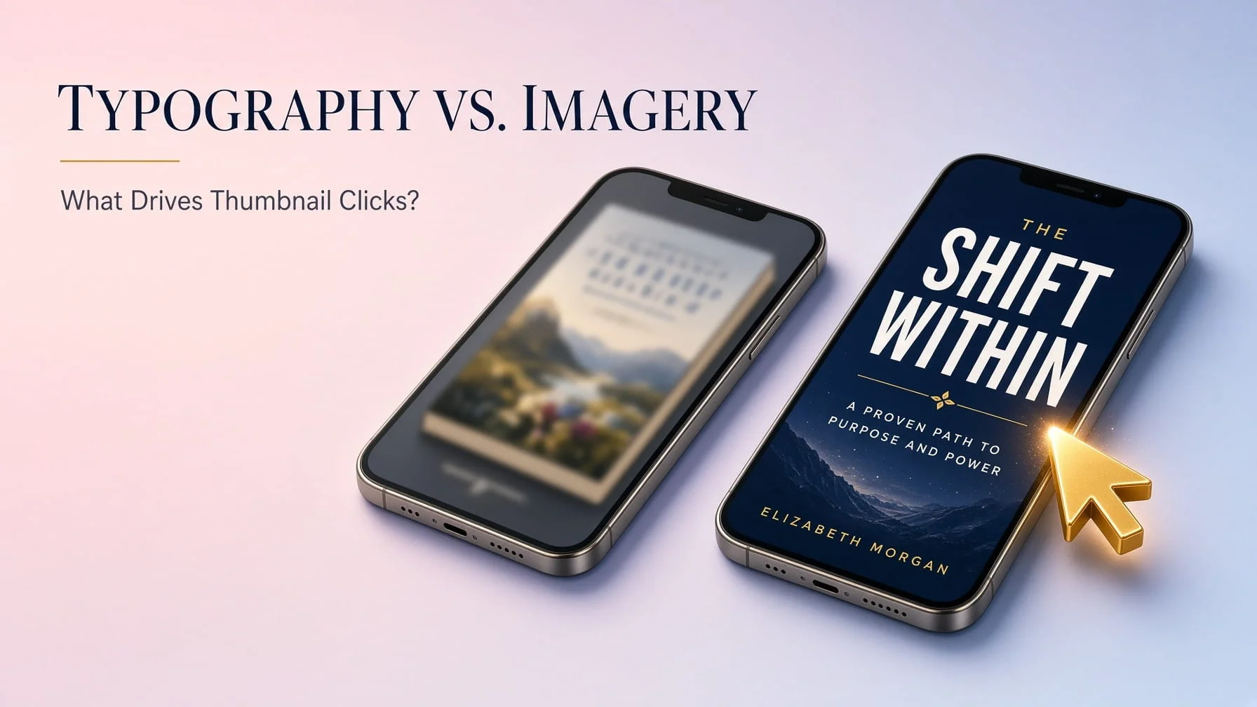
Most authors obsess over the artwork on their cover and treat the title text as an afterthought dropped in once the image looks finished. That instinct is backward. At the size most readers actually encounter a book cover a small thumbnail on a phone screen, scrolling past dozens of competitors in a search results grid typography frequently does more work than imagery does.
The Visual Psychology of a Three-Second Decision
Readers make a stop-or-scroll decision on a book cover in roughly the time it takes to register a shape and a color before conscious thought even catches up. That’s not enough time to appreciate fine illustrative detail, but it’s plenty of time to register whether text is legible, whether the composition feels intentional, and whether the overall impression matches a genre they’re already interested in. Covers optimized for full-size viewing frequently fail this three-second test entirely, because the details that made them impressive at large scale simply disappear at thumbnail size.
Visual Hierarchy in Small Digital Thumbnails
A cover needs an obvious focal point that survives dramatic size reduction one dominant visual element the eye lands on immediately, not five competing details fighting for attention. Title text needs to sit in clear visual hierarchy above or below that focal point, not crammed awkwardly around it or competing with a busy background for legibility. Testing a cover design specifically at thumbnail size, not just full resolution, catches hierarchy problems before they cost real clicks on a live listing.
Font Readability Isn’t Negotiable at Small Scale
Elaborate, highly stylized fonts that look striking on a large poster frequently become illegible mush at 150 pixels wide. Bold, clean typefaces with generous letter spacing survive size reduction far better than delicate script fonts or heavily decorative lettering, even when the more elaborate option objectively looks more “designed” at full size. A title a reader can’t actually read at thumbnail size might as well not be there it forfeits the one piece of information guaranteed to communicate content and genre instantly.
Contrast Dynamics: Why Some Covers “Pop” and Others Disappear
Strong contrast between title text and background not necessarily in color alone, but in value, meaning how light or dark each element reads determines whether text separates cleanly from its background or blends into visual noise. A pale title over a similarly light background might look sophisticated and subtle at full size, then vanish almost entirely once shrunk down next to a dozen higher-contrast competitors in a search grid. Contrast isn’t a stylistic afterthought here; it’s a functional requirement for the cover to actually do its job at the size readers encounter it.
Genre-Specific Visual Cues Readers Scan For Instinctively
Readers browsing a genre have absorbed hundreds of covers in that category without consciously studying any of them, and they scan new covers for familiar visual shorthand: specific color palettes, particular typography styles, recognizable compositional patterns. A thriller cover using soft pastel colors and delicate script typography, however well-executed as design, sends a genre-mismatched signal that can actively suppress clicks from the exact readers most likely to buy it, simply because it doesn’t read as “thriller” in that split-second scan.
So Which Actually Wins: Typography or Imagery?
The honest answer is neither wins in isolation the strongest covers use typography and imagery as one coordinated system rather than two separate elements layered on top of each other. But when budget or attention has to prioritize one over the other, typography deserves more weight than most authors give it, precisely because it’s the element most directly sacrificed by resizing, and the element most directly responsible for genre-signal recognition in that critical three-second scan. A striking illustration undermined by illegible or genre-mismatched typography still loses the click. Legible, well-considered typography paired with even a modest image regularly outperforms it.