
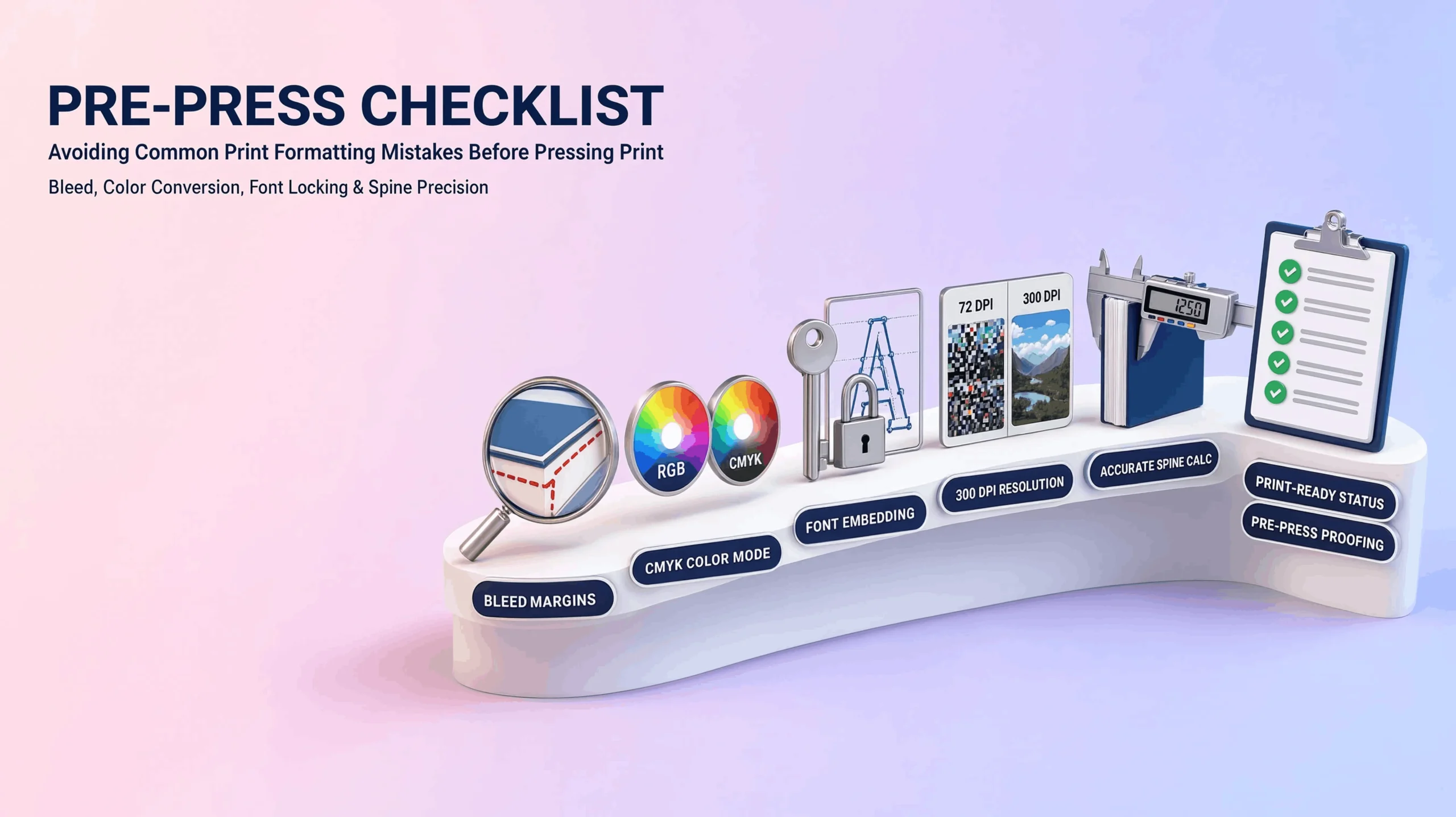
Most printing disasters aren’t really printing problems. They’re file problems that only become visible once ink hits paper by which point you’re paying for a reprint instead of a correction. Here’s what actually needs checking before a file goes anywhere near a press.
Bleed Margins: The Mistake That Leaves a White Sliver
Bleed is the extra image area extending past your book’s final trim edge, and it exists because cutting a printed sheet down to size is never perfectly precise machines shift by fractions of a millimeter. Without bleed built in, any illustration or background color meant to run to the page’s edge can leave a thin white sliver where the trim landed slightly inside your artwork instead of outside it. The standard is usually a small margin, typically around an eighth of an inch, extended past the trim line on every side. Skipping this is one of the most common and most avoidable reasons a print run comes back looking unfinished.
CMYK vs. RGB: Why Your Colors Might Print Wrong
Screens display color using RGB red, green, blue light combining to create every shade you see. Printing presses use CMYK cyan, magenta, yellow, and black ink layered together. These are different systems, and a file built in RGB doesn’t translate directly to CMYK without some shift. Certain vivid blues and greens that look perfect on a monitor can turn duller or slightly off once converted to ink. Converting your files to CMYK before submission, rather than letting the printer’s software make that call automatically at the last second, gives you a far better sense of what’s actually going to print.
Font Embedding: A Small Setting With a Big Consequence
If a font isn’t embedded in your final print file, the printer’s system substitutes something close when it doesn’t have that exact font installed and “something close” can quietly wreck your spacing, your chapter headers, or your cover typography. Embedding fonts locks the actual font data into the file itself, so what you designed is exactly what prints, regardless of what fonts happen to be installed on the printer’s end.
Image Resolution: Why 300 DPI Isn’t Just a Suggestion
Images built for screens are typically 72 DPI dots per inch which looks sharp on a monitor but turns visibly pixelated once scaled up for print. Print-ready images need to be at least 300 DPI at their final printed size. A photo that looks crisp as a small web thumbnail can look rough and blurry once it’s blown up to fill half a page in your book, simply because there wasn’t enough resolution captured to support that size.
Spine Width: The Calculation Authors Forget Until It’s Too Late
Spine width isn’t a fixed number it’s calculated from your paper stock’s thickness multiplied by your total page count. A 200-page book on standard paper has a noticeably different spine width than a 400-page book on heavier stock, and that number changes your entire cover file’s layout, not just a measurement in a spec sheet somewhere. Designing a cover before finalizing your page count is one of the most common ways authors end up needing a cover redo late in the process, usually right when they thought they were finished.
Putting the Checklist Together
None of these five items are complicated in isolation. Bleed, color mode, font embedding, resolution, spine width each one takes a few minutes to verify. What actually causes reprints is skipping the verification entirely and assuming the file that looked right on screen will look right on paper. Running through this checklist before submission, or having professional book printing services for authors run it for you as a formal pre-press proofing step, is the difference between a proof copy that confirms your book is ready and one that sends you back to the drawing board.