
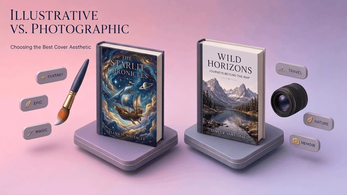
Authors often pick a cover style based purely on personal aesthetic preference, which is understandable and frequently the wrong starting point. Genre convention and reader expectation matter more than an author’s individual taste here, because the cover’s job is signaling to a specific reader that this book is exactly what they’re looking for.
Fantasy: Where Illustration Almost Always Wins
Fantasy readers expect and actively seek out illustrated covers detailed character art, imagined landscapes, mythical creatures rendered in a style that immediately signals the genre. A photographic approach to fantasy struggles fundamentally, since real photography can’t easily depict dragons, magic systems, or invented worlds without looking staged or oddly literal. Custom illustration costs meaningfully more than a photographic or stock-based approach, but for fantasy specifically, that investment tends to pay for itself through genre-appropriate signaling that a photographic cover simply can’t replicate.
Romance: A Genre Split Between Two Distinct Aesthetics
Romance covers split cleanly into two dominant camps: illustrated covers with a warm, often whimsical style common in contemporary and cozy romance, and photographic covers featuring couples or evocative imagery common in more dramatic or steamy subgenres. Choosing between them depends heavily on the specific romance subcategory a lighthearted small-town romance and a dark romantic suspense novel signal completely different reader expectations through cover style alone, and mismatching the two actively confuses the genre-savvy readers most likely to buy either one.
Non-Fiction: Photography and Clean Design Typically Lead
Non-fiction covers, particularly in business, self-help, and memoir categories, lean heavily toward photography or clean typographic design over illustration. Illustration in non-fiction can occasionally read as less credible or authoritative, depending on subgenre, unless the illustrated style is specifically established as a recognizable convention within that particular niche. A strong author photo, a clean symbolic image, or confident typography-forward design typically outperforms an illustrated approach for most non-fiction categories.
Thrillers: High Contrast, Minimal Imagery, Maximum Tension
Thriller and suspense covers tend to favor stark, high-contrast photographic or graphic design approaches a single striking image, often abstract or partially obscured, paired with bold typography. Overly detailed or busy imagery undercuts the genre’s core promise of tension and unease; the most effective thriller covers frequently say less visually while implying considerably more through shadow, negative space, and a title that carries real weight on its own.
Production Timelines: What Actually Takes Longer
Custom illustration generally requires a longer production timeline than a photographic or stock-based cover, since original artwork moves through concept sketches, revision rounds, and full rendering rather than sourcing and adapting existing imagery. Authors on a tight timeline sometimes default to photographic covers purely for speed, which works fine for genres where photography is already the convention, but becomes a genuine mismatch for genres like fantasy where illustration is the reader-expected norm regardless of how long it takes to produce.
Custom Art Costs vs. Market Expectations
Custom illustration costs more upfront than a photography or stock-based design, and that cost difference is a legitimate budget consideration but it’s worth weighing against genre expectation specifically, not against cost alone. A fantasy novel with a photographic cover, chosen purely to save budget, risks signaling the wrong genre to the exact readers most likely to buy it, which can cost more in lost sales over time than the illustration would have cost upfront.
Making the Right Call for Your Specific Book
The right aesthetic choice starts with genre research, not personal preference. Pull up the current bestseller list in your specific category and subcategory, and look honestly at what’s actually working there not what you personally find visually appealing, but what readers in that genre are demonstrably responding to and buying. Matching that established visual language, whether it leans illustrative or photographic, gives a new cover its best shot at reading as immediately familiar and trustworthy to the exact audience it needs to reach.