
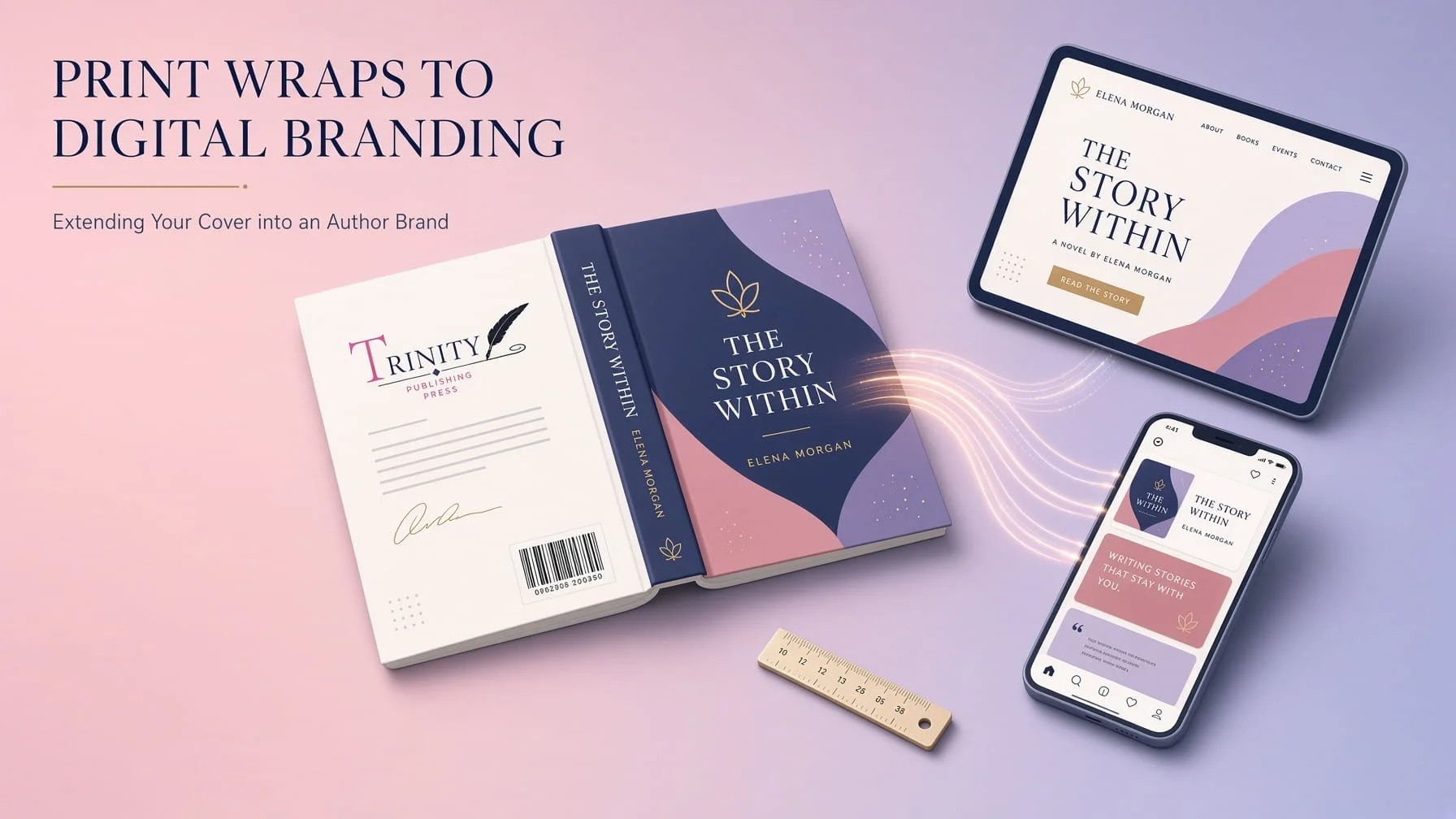
A book cover’s job doesn’t end once the front image is approved. For print editions, that same design has to extend into a full wrap, and for a serious author brand, it has to extend even further into social graphics, a website, and every promotional touchpoint a reader might encounter.
Spine Calculation Math, Explained Simply
Spine width is a function of two numbers: total page count and paper stock thickness, typically expressed as pages-per-inch for a given stock. A 200-page paperback on standard stock produces a noticeably narrower spine than a 450-page book on heavier paper, and getting this calculation wrong means text or design elements meant for the spine either get awkwardly cramped or leave excessive dead space around them. This is exactly why spine design happens after page count is finalized, not guessed at during initial cover concepting before that number is locked.
Back Cover Copy Layout: More Than Just Pasting in Text
Back cover design has to balance descriptive copy, author bio, a barcode placement area, and often review quotes, all within a layout that stays visually consistent with the front cover’s design language. A common mistake is treating the back cover as an afterthought plain text dropped onto a solid color background when it’s actually prime real estate for reinforcing the same visual identity the front cover already established, using consistent typography and color choices rather than starting from a blank slate.
Cross-Platform Graphics: One Cover, Many Formats
A finished cover design needs to adapt across formats readers will actually encounter it in a square social media post, a wide banner for a website header, a vertical story format for platforms that favor that orientation. Building these variations from the original cover file, using consistent typography and color choices, keeps an author’s visual presence recognizable across every platform instead of looking like a different, disconnected project on each one.
Social Media Kits: Turning One Design Into a Promotional System
A proper social media kit built from cover assets includes pre-sized graphics for major platforms, pull-quote templates using the same typography as the cover, and countdown or launch-day graphics that all clearly belong to the same visual family as the book itself. Authors without this kit tend to improvise promotional graphics individually as launch day approaches, usually under time pressure, producing a scattered, inconsistent visual presence exactly when consistency matters most for building recognition.
Integrating Cover Assets Into Author Website Design
A cover’s color palette, typography choices, and overall visual mood should carry directly into Author Website Design rather than existing as a completely separate design decision made independently. A reader who loved the cover and then lands on a website that looks nothing like it experiences a small but real disconnect a missed opportunity to reinforce the same visual identity that got them curious enough to click through in the first place.
Building a Cohesive Author Brand From One Strong Cover
The authors who build the most recognizable presence over multiple books aren’t necessarily the ones with the single most beautiful individual cover they’re the ones who extended one strong design system consistently across every format and touchpoint a reader might encounter. A cover is the starting point of that system, not the entire project. Treating spine design, back cover layout, social graphics, and website design as one connected visual identity, rather than a series of disconnected tasks handled separately, is what actually turns a good cover into a genuine author brand readers recognize on sight.