
Paper doesn’t get much thought from most first-time authors until they’re holding a finished proof copy that feels wrong somehow too thin, too heavy, the wrong shade of white. By then it’s a late and expensive lesson. Paper choice shapes the reading experience more than almost any other production decision, and it’s worth understanding before you’re staring at a dropdown menu with no context for what any of it means.
Uncoated vs. Coated Paper: Two Completely Different Reading Feels
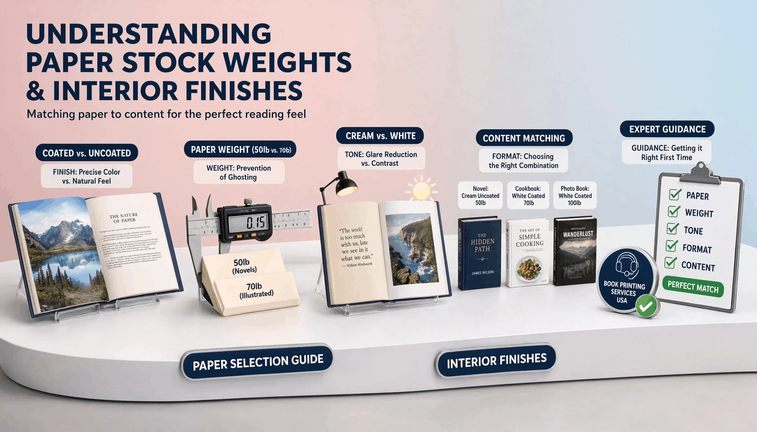
Uncoated paper has a natural, slightly textured surface the classic novel-page feel, easy on the eyes for long reading sessions and less prone to glare under indoor lighting. Coated paper has a smoother, often glossier surface that handles color and image detail with more precision, which is why it shows up in photo-heavy books, cookbooks, and illustrated nonfiction. Put text-heavy fiction on coated stock and it can feel oddly slick to hold and read for hours; put a photography book on uncoated stock and the images lose some of the sharpness and color depth they were designed to show off. The paper needs to match what’s actually on the page.
50lb vs. 70lb Stock: What the Number Actually Means
Paper weight refers to the weight of a ream of that paper at a standard size, and higher numbers mean thicker, more substantial pages. A 50lb stock is lighter and thinner common for standard novels where keeping the overall book from becoming unwieldy at higher page counts matters. A 70lb stock is noticeably more substantial, often chosen for books with images or illustrations, where thinner paper would let content on the reverse side show through and distract from what’s printed on the current page. That show-through issue, called ghosting, is the main reason to size up in weight for anything image-heavy.
Cream vs. White Pages: The Detail Nobody Notices Until They Do
Cream paper has a warm, slightly off-white tone that reduces glare and eye strain during long reading sessions, which is why it’s the near-universal default for novels. White paper offers more contrast and makes colors and photos pop with more accuracy, which is why it’s the standard for photo books, cookbooks, and anything where visual accuracy matters more than reading comfort. Put a novel on stark white paper and some readers will describe it as harsh without being able to say exactly why it’s usually the contrast level working against long-session reading comfort.
How Paper Choices Compound Into the Final Reading Experience
None of these decisions exist in isolation. A cookbook printed on cream, uncoated, 50lb paper would look muted and slightly blurry wrong paper for the content. A novel printed on white, coated, 70lb stock would feel unnecessarily heavy and glossy for a book meant to be read cover to cover in a few sittings technically fine paper, wrong fit for the format. The right combination depends entirely on what your book actually is and how readers will realistically use it, not on picking whatever option sounds most premium on a spec sheet.
Getting This Right the First Time
This is exactly the kind of decision where getting a second opinion from people who print hundreds of titles a year saves both money and a frustrating do-over. The best book printing services in USA don’t hand a first-time author a spec sheet and walk away they ask what the book actually is, how it’s likely to be read, and match paper weight, coating, and page tone to that answer specifically. Getting these choices right the first time is the difference between a finished book that feels intentional in someone’s hands and one that just feels like a printed file.