
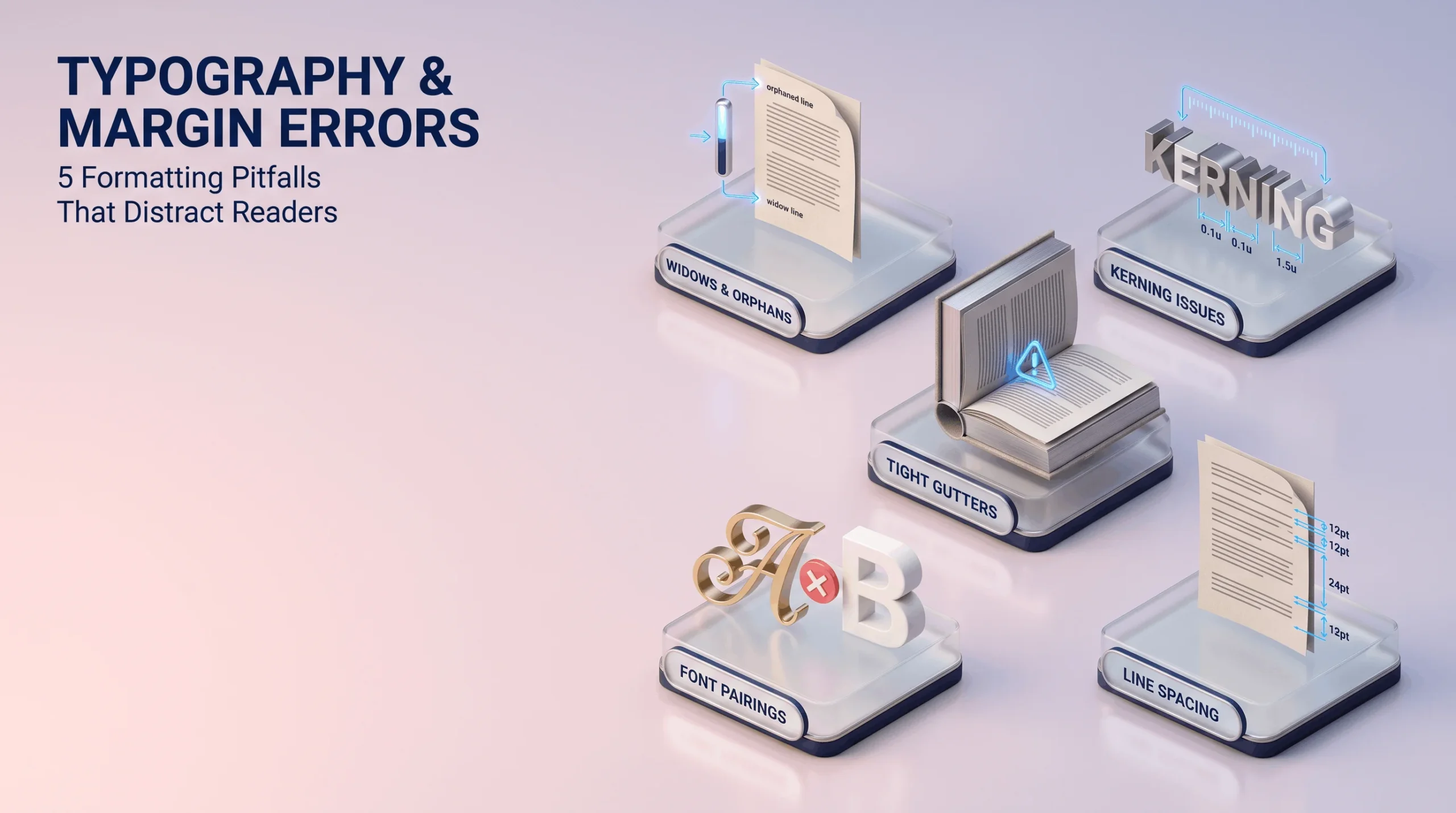
Good formatting is invisible readers don’t consciously notice clean typography, they just read comfortably without friction. Bad formatting, on the other hand, is impossible to ignore, even for readers who couldn’t name exactly what’s wrong. Here are the five errors that show up constantly in self-formatted manuscripts.
Widows and Orphans: The Stray Lines Nobody Means to Leave Behind
A widow is a single line from a paragraph left stranded alone at the top of a new page; an orphan is that same kind of stray line left alone at the bottom of a page, separated from the rest of its paragraph. Both create a visually awkward gap that interrupts reading flow, and both are entirely fixable with deliberate manual adjustment but they require someone actually checking for them page by page, since automated formatting tools frequently miss them entirely.
Bad Kerning: The Spacing Issue Readers Feel Before They See
Kerning refers to the spacing between individual letter pairs, and poor kerning creates text that looks subtly cramped or oddly loose without an untrained eye being able to pinpoint exactly why it feels off. This is especially noticeable in larger display text chapter titles, cover typography where letter spacing issues become far more visually obvious than they would in smaller body text. Professional typesetting adjusts kerning manually where automated defaults produce visibly awkward letter pairs.
Tight Gutters: The Print-Specific Error That Ruins Readability
The gutter is the margin space closest to a book’s spine, and a gutter set too tight means text on the inner edge of each page gets partially swallowed by the binding once the book is physically bound. This error is invisible in a digital proof viewed flat on a screen and becomes immediately, frustratingly obvious only once a physical proof copy arrives with several words genuinely unreadable near the spine on every page.
Inappropriate Font Pairings: When Typefaces Actively Work Against Each Other
Pairing two fonts with clashing personalities an ornate, decorative display font next to a body font with a completely different visual weight and style creates a page that feels visually disjointed rather than intentionally designed. Strong font pairings share some underlying visual harmony, whether through complementary proportions or a shared design era, while still providing enough contrast to distinguish headers from body text clearly.
Inconsistent Line Spacing: The Error That Compounds Across Every Single Page
Line spacing that shifts subtly between chapters, or even between paragraphs within the same chapter, creates a page that reads as inconsistent even when no single page looks obviously wrong in isolation. This error is particularly common in manuscripts formatted piecemeal, in multiple editing sessions, without a single consistent style guide applied uniformly across the whole document from beginning to end.
How Professional Typesetting Actually Fixes These Errors
Professional formatting catches these issues through deliberate, methodical page-by-page review rather than trusting an automated export process to handle every edge case correctly on its own. Widows and orphans get manually adjusted paragraph by paragraph. Kerning gets fine-tuned specifically on display text where it matters most visually. Gutter margins get calculated against actual trim size and page count before a print file is ever finalized. Font pairings get chosen deliberately for genre and visual harmony rather than defaulted to whatever a template happens to ship with. None of this happens automatically it takes a trained eye checking for exactly these specific, well-known failure points.
Why These Small Details Genuinely Matter This Much
None of these five errors are individually catastrophic. A reader won’t necessarily abandon a book over one stray widow on page 47. But these errors compound across an entire manuscript, and readers register the cumulative effect even when they can’t articulate the specific cause the vague, hard-to-name sense that a book “feels” unpolished or amateurish. Clean typesetting doesn’t get noticed. It just lets the actual story do its job without formatting friction quietly working against it the whole way through.